ANALYZING BIKE SALES: BUILDING AN EXCEL DASHBOARD
As I reflect on my journey in data analysis and visualization, one project that stands out is my work on bike sales. It was an incredible opportunity to dive deep into a dataset filled with valuable information about customer demographics, bike models, sales regions, and performance metrics. The goal was clear: create an Excel dashboard that would bring this data to life and provide meaningful insights. Join me as I walk you through the process and showcase the skills I acquired during this project, making it a valuable addition to my resume.
Understanding the Bike Sales Project
The first step was to immerse myself in the bike sales data. I carefully examined the dataset, absorbing its nuances and gaining a deep understanding of the information it contained. It was fascinating to see how different variables interplayed and influenced bike sales.
Setting up the Pivot Table
To organize and summarize the vast amount of data, I turned to Excel's powerful pivot table functionality. Creating the pivot table was like building a strong foundation for my project. It allowed me to manipulate, filter, and aggregate the data effortlessly, providing a solid base for generating insightful visualizations.
Visualizing Bike Sales Data
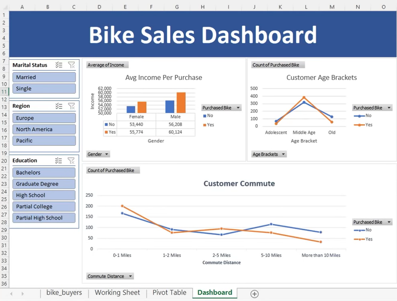
Visualizations are the gateway to understanding complex data. I harnessed the power of Excel's charting tools to create compelling visuals that would captivate viewers. Bar charts enabled me to compare sales performance across various bike models, while line charts brought sales trends to life, highlighting patterns and fluctuations over time. Pivot charts, with their interactive nature, offered an engaging overview of the sales data.
Building the Bike Sales Dashboard
I felt a surge of excitement as I embarked on the task of building the dashboard. It was like piecing together a puzzle, carefully arranging the visualizations to create a cohesive and intuitive layout. I wanted users to navigate effortlessly, effortlessly exploring the data and gaining insights with ease. By copying the pivot table sheet and pasting it onto a new sheet, I ensured that any changes made to the pivot table would seamlessly propagate to all the visualizations in the dashboard.
Adding Interactive Filters
To take the user experience to the next level, I incorporated interactive filters called slicers. These powerful tools allowed users to dynamically filter the data based on specific criteria, such as bike models, sales regions, or customer demographics. It was thrilling to witness the data transform before my eyes as users manipulated the filters, uncovering hidden trends and making meaningful discoveries.
Analyzing Bike Sales Data
It was remarkable to witness how different dimensions of the data interacted and influenced bike sales. Users could analyze the sales performance of different bike models, identify trends in specific regions, or compare sales across various customer demographics, all within a few clicks.
Customizing and Finalizing the Dashboard
To add a personal touch and make the dashboard truly mine, I invested time in customization. I selected color schemes that resonated with the bike sales theme and adjusted font sizes to ensure optimal readability. Titles and labels were meticulously added to each visualization, enhancing clarity and guiding users through their data exploration journey. The balance between visual appeal and functional integrity was key.
My journey in building an Excel dashboard for bike sales data was an enriching experience. It showcase my skills in data analysis, visualization, and creating an interactive user experience. Through this project, I honed my ability to organize complex information, present it in a visually appealing manner, and empower users to make data-driven decisions.